Illustrating the Merger of Six Companies
Published on Medium
A Brief History
When Uplight was born in the summer of 2019, six individual companies with similar and complimentary software solutions merged to join forces in the fight against climate change. It was (and is!) exciting, and with an expanded set of capabilities and many wonderful new colleagues, some celebration was in order! When the champagne was gone and the dust had settled, our product, engineering, and design teams began the daunting task of determining how our collective products actually come together.
From a design perspective, the need for a unified design system was abundantly clear. It came as no surprise that products from six different companies all looked, felt, and behaved quite differently. As a tool to communicate to customers and end users that we offer a cohesive experience, help unite new colleagues, ensure our products are ADA compliant, and save designers and engineers immeasurable time, an Uplight design system felt more essential than ever post-merger.
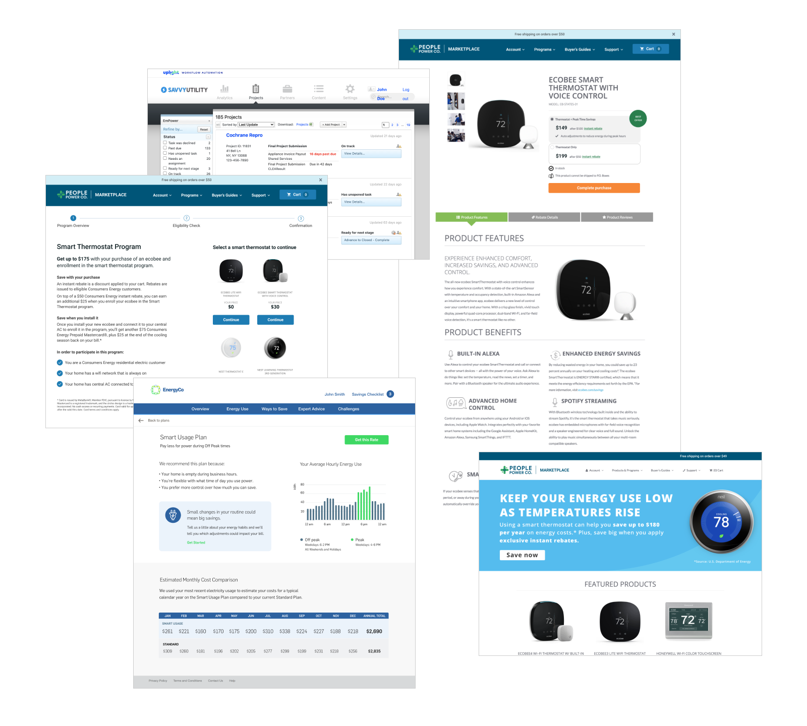
Illustration in Product Design
A key component of any design system, illustration has been used as a means of communication since the dawn of time, quite simply because it is an extremely effective way to quickly convey concepts. Transcending language and accessible to the masses, illustration is used in software design to aid navigation, educate the user, draw attention to specific content & features, and inject personality and life into our products. When used effectively, illustration offers users mental shortcuts and reduces cognitive load—ultimately helping them accomplish their goals faster. In Uplight’s case, illustration and icons ultimately serve to help end users understand and take action on their energy usage.
Since I come from an illustration background and really enjoy this work, I was excited to embark on the process of defining and building this portion of our design system. Using an Agile set of spikes and stories, I started with an audit to document and understand our illustration needs.
Step 1: The Audit
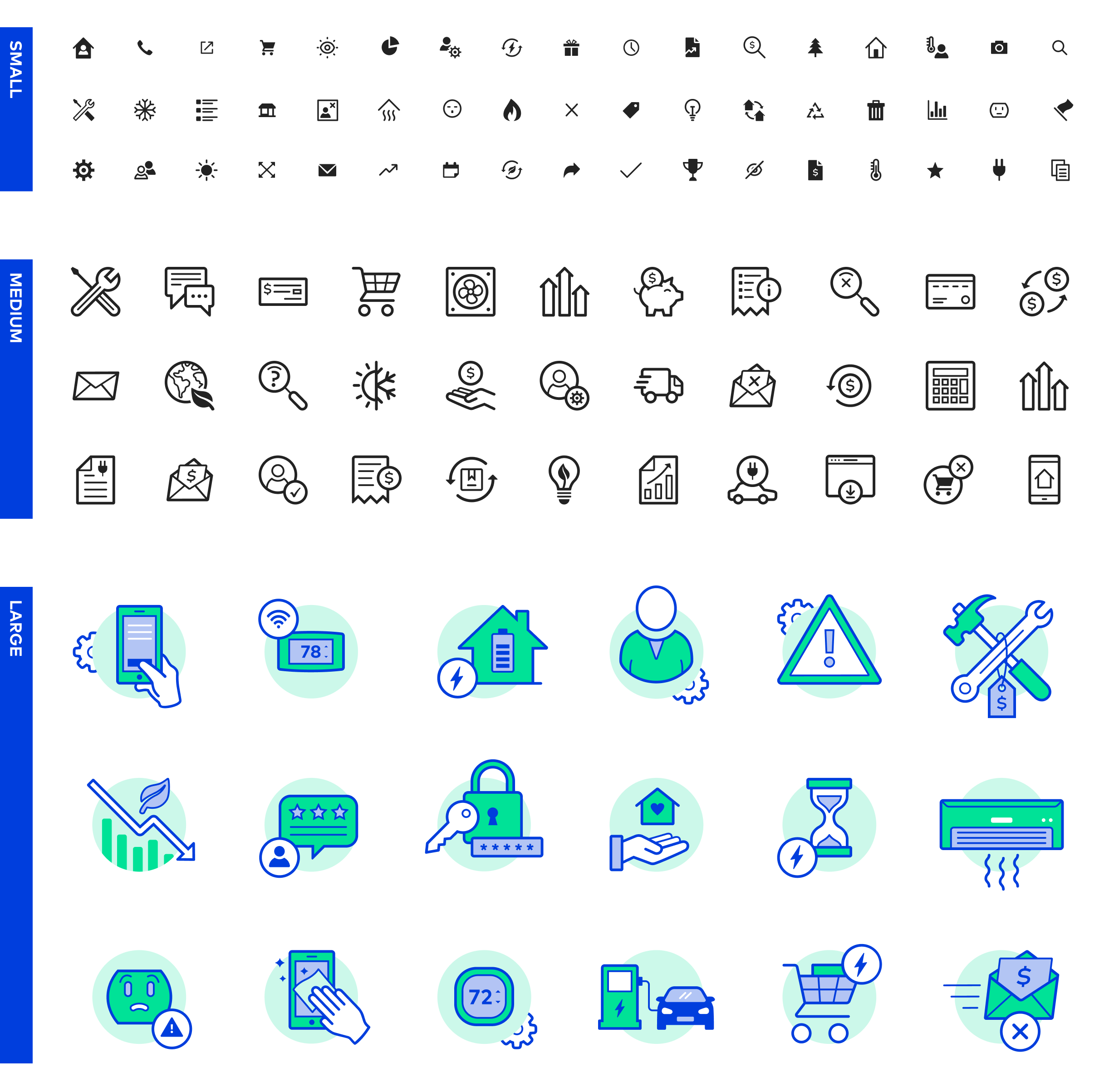
In order to understand our needs, I first needed to wrap my mind around the existing state of how we used illustration and icons in our products. To do so, I conducted an audit of every product from each legacy company to inventory existing styles, identify any overlap or duplicates, and begin to consider styles that we might want to carry forward into an Uplight style. Looking at each product line, I dissected each product and documented every instance of illustration and icon use, including: 1) a visual of its state at the time, 2) where in the product it was being used, and 3) what purpose it served. At the time of the audit, this included taking a thorough look at 9 separate products across 4 product lines, resulting in 106 unique illustrations & icons.
The audit revealed a plethora of stylistic differences. For example, some of the existing illustrations used solid color, while others used gradients; some were depicted as 3D objects, while others were flat; some were quite detailed and complex, while others were very simple; and some strokes were bold and thick, while others were thin and delicate. Additionally, the location and purpose of our illustrations and icons varied significantly. From simple icons being used in conjunction with navigational elements to more involved illustrations describing onboarding steps, the audit made it clear that a new Uplight style would not be a one-size-fits-all solution.
Step 2: Classification
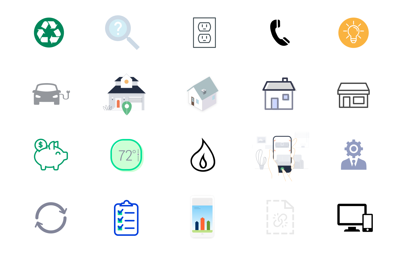
The audit confirmed that when it comes to illustrations and icons, context is key. The beautiful details in a large onboarding illustration will become visual noise when reduced to more of a thumbnail image. Similarly, a small and simple navigational icon will feel like it’s missing something when enlarged. Informed by the audit, I identified three different classifications we’d need and organized the icons accordingly.
Small (64)
Often used in-line with text, these icons are primarily used to aid navigation, reinforce certain pieces of content, and break up dense copy blocks. By necessity of their size, these icons are stylistically very simple in order to read clearly at small sizes.
Medium (22)
Often used as textural elements, to add visual interest, and to anchor content, medium icons add personality to our layouts. Still stylistically simple, their larger size allows for slightly more detail than the small icons.
Large (20)
Typically used to depict specific processes, large illustrations are used to visually balance layouts and engage users. Because a larger size enables the use of more detail and color, this set of illustrations can be a powerful method of reinforcing Uplight or utility branding.
Step 3: Style Definition
Once the classifications were established, I could proceed with exploring what an Uplight illustration and icon style looks like. Given that our design team has doubled in size since the merger and continues to grow, clear stylistic guidelines are essential to ensure that other designers can jump in and contribute as our team evolves. Specifically, we would need rules around tangible things like stroke thickness, color usage, treatment of corners, and use of dimension as well as more general guidelines like use of detail.
However, before getting into design specifics, I needed to carefully consider the white-labeled nature of Uplight’s SaaS products, which made this illustration and icon definition markedly different from others I have worked on. In previous sets I’ve created, there was only one brand to consider, meaning that the illustrations and icons could be completely custom to the look and feel of that particular brand. For Uplight’s design system, I knew that whatever style we landed on needed to be flexible enough to suit all of our 80+ utility partner brands—each with a very different overall look and feel. Because of this, our style would need to be somewhat general in order to mesh with more than 80 unique brands.
With this in mind, I proceeded with the fun part—design! In general, my approach to illustration and icon design is to start with a grid system, as this lays the foundation for visual consistency. From there, it’s a lot of experimentation, trial and error, and iteration to land on a style that feels right. While exploring styles, I make sure to test out various grids, stroke widths, line qualities, containers, and color & corner treatments. Most importantly, I test the icon in context and ask myself the following questions:
- How does the overall weight of the icon feel?
- Are the negative spaces working?
- Does the grid provide enough flexibility for the level of detail needed?
- Is the icon reading well and serving its purpose in this context?
I went through this process with several icons from each classification and ultimately arrived at the following guidelines for each.

In addition to the classification-specific guidelines above, this process also helped me identify a set of guiding principles applicable to all Uplight illustrations and icons. While bending the rules is occasionally necessary, the majority of cases should abide by the following:
- Keep it simple: Attempting to communicate more than one concept per icon is likely to cause user confusion—stick to one concept per icon.
- Rounded stroke terminals & corners: Avoid sharp corners in order to maintain a tone of friendliness.
- Minimal detail: Don’t include more detail than is necessary to the communication of the concept—excessive detail causes visual noise. Minimal detail also enables our icons and illustrations to be general enough to translate to our utility partners.
- Flat, not 3D: Objects are depicted as flat shapes rather than 3D objects. In most cases, this enables faster comprehension of the icon.
- 45° angles: Angles should be 45° when possible. This enables the pixels to align corner-to-corner, which reduces the appearance of pixelation.
Step 4: The Build Out
Armed with these guidelines, I progressed to the build out of the entire set. Completed iteratively over the course of several sprints, I started with creating the small set, then the medium, and finished with the large. It made sense to approach it this way, as several components of the small set would be used in the medium and large sets in order to maintain a consistent visual language across the various sizes. When complete, each instance was made a component in Figma in our design system and published to the entire team library which allows all of our designers to easily drag-and-drop as needed for mockups and feature design work. At the time of article publishing, Uplight has 225 (and counting) unique and visually consistent icons and illustrations.
Use Cases
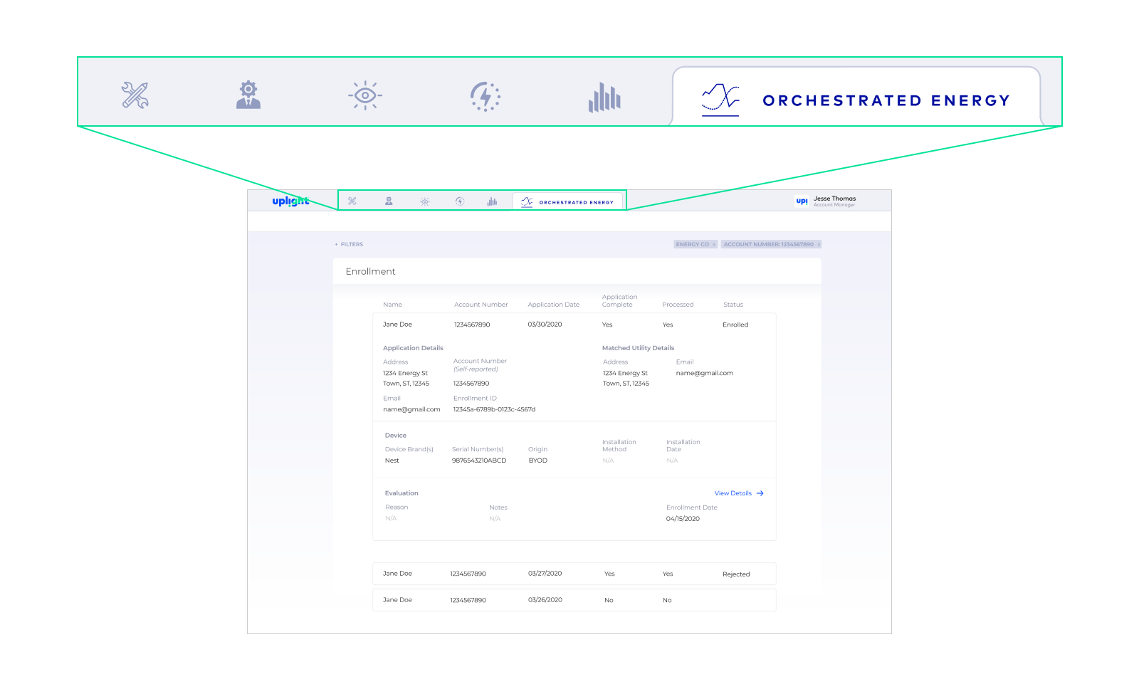
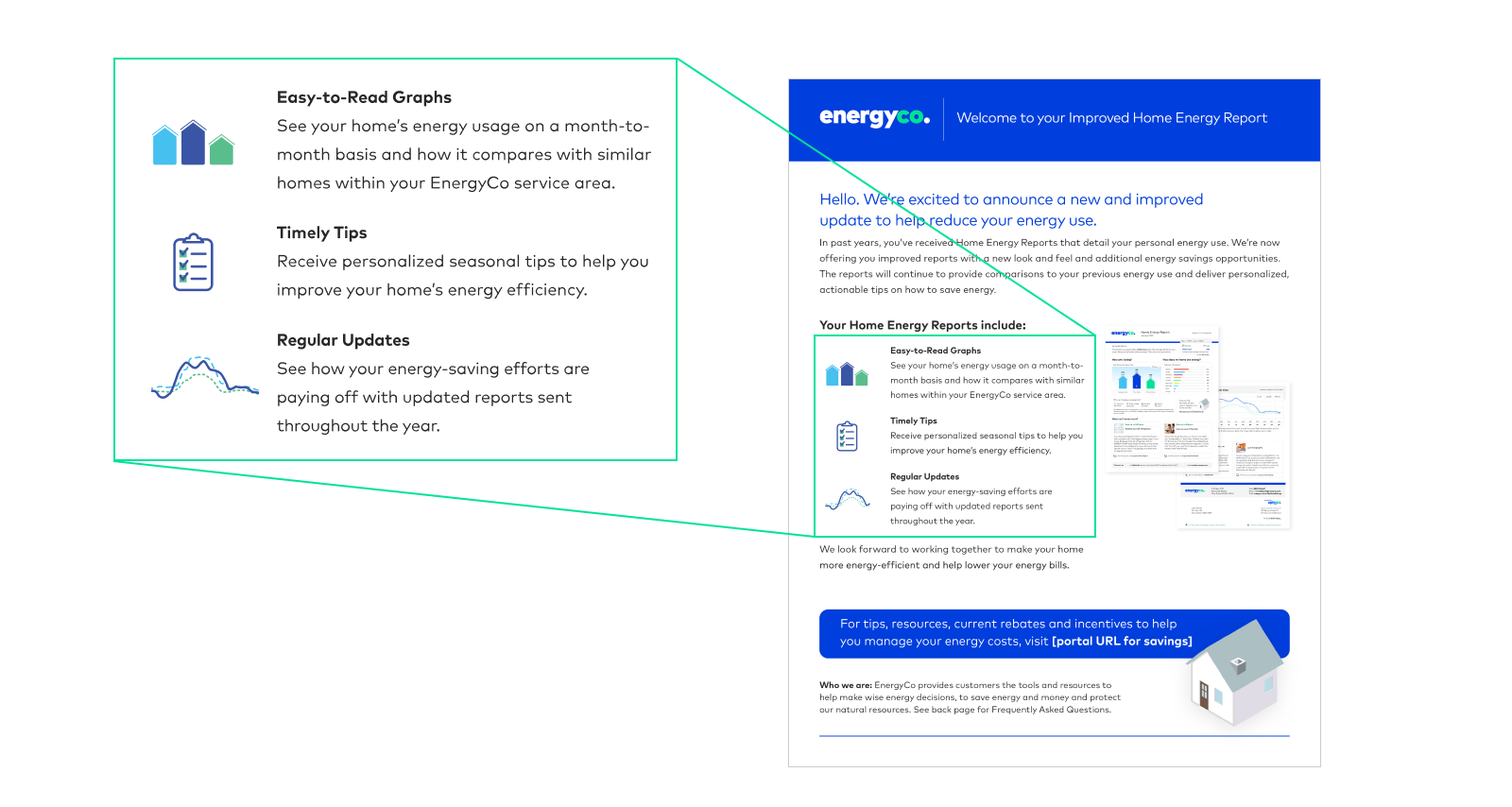
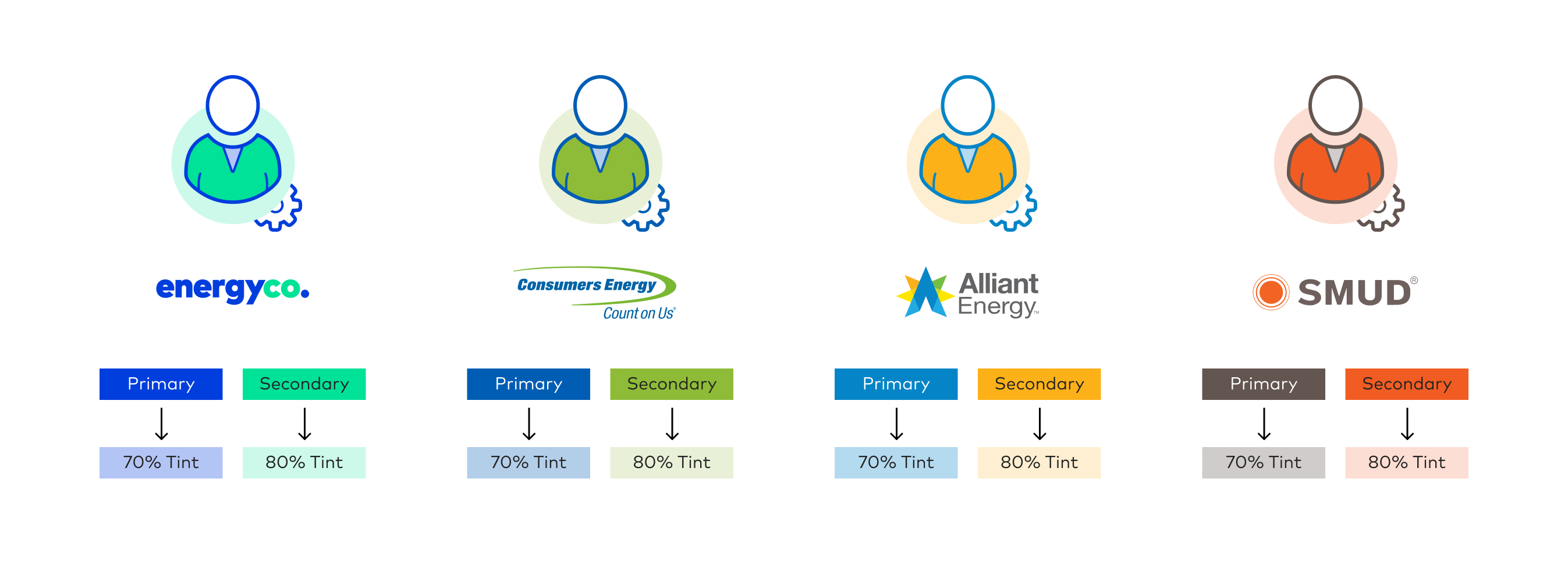
With dozens of clients and unique brands to accommodate in our products, we needed a way to customize the large illustration set without creating significant manual lift for design and engineering. By inserting icons in products as SVGs, we are able to modify colors using hex codes. A designer selects a primary and secondary color from the respective client’s brand palette, and tints of both are generated in code to create the additional colors. This removes the need to manually configure the illustrations, export, and insert into products resulting in reduced time to launch.
Animation
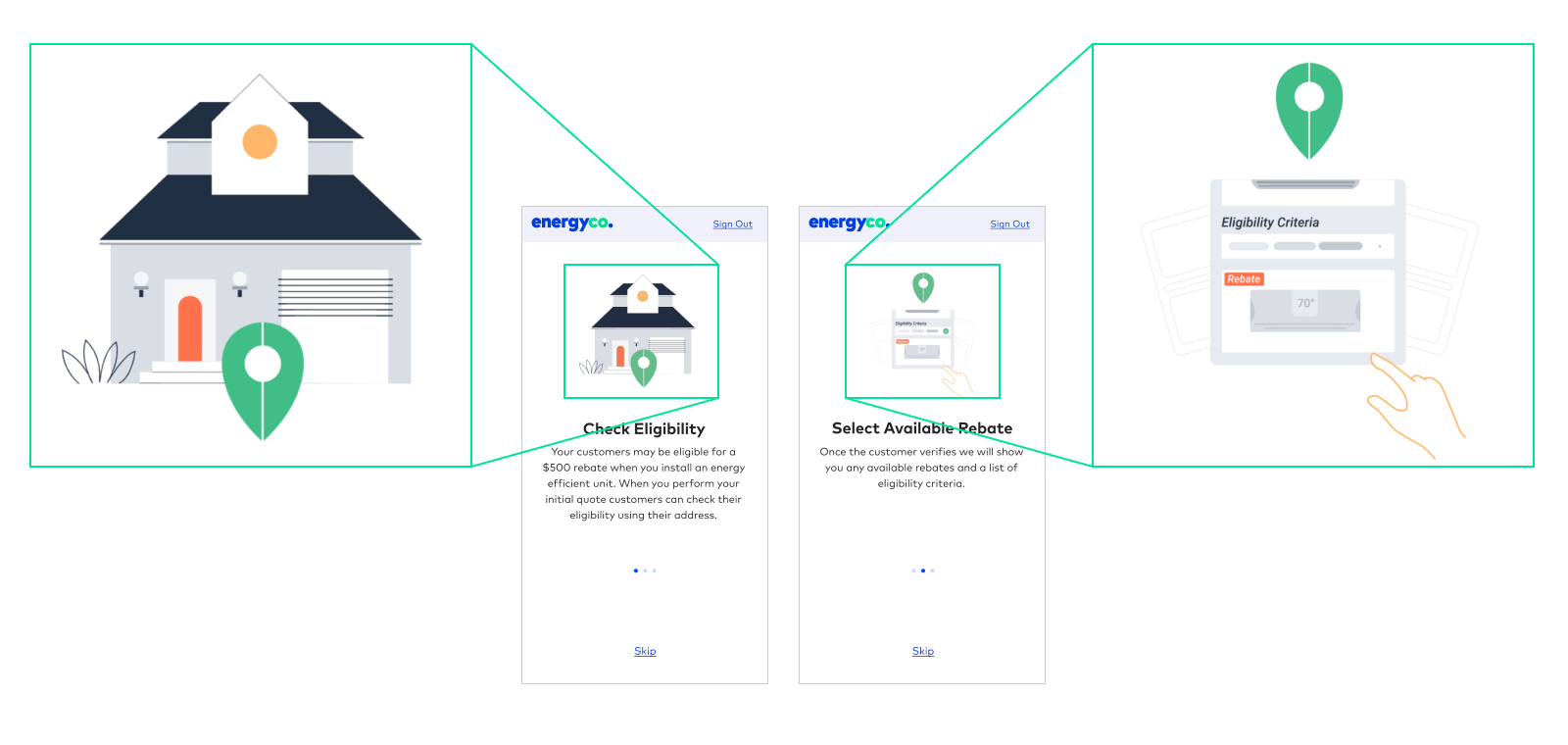
The large illustration set lends itself well to animation, which adds a touch of personality and delight to our products. Here is an example of JSON Lottie animations used in an onboarding series for Uplight’s Contractor Rebates application.


 Afton McCann Design