Accommodating a Brand Refresh in Email
Published on Website Magazine
As brands evolve, grow, merge, and undergo the many other transitions that are inevitable in business, so must their images. Even the most iconic and recognizable of brands (Coke, Apple, Shell, Windows—to name just a few) have re-invented their visual identities multiple times. Thus, when Marriott and Starwood announced their merger, we knew it was only a matter of time before a new brand was revealed and an updated template design would be necessary. We approached the Marriott Rewards template redesign with the primary objectives of reflecting the new brand within the confines of email best-practices, and greatly simplifying the overall look & feel.
1. Identifying & Implementing Key Brand Components
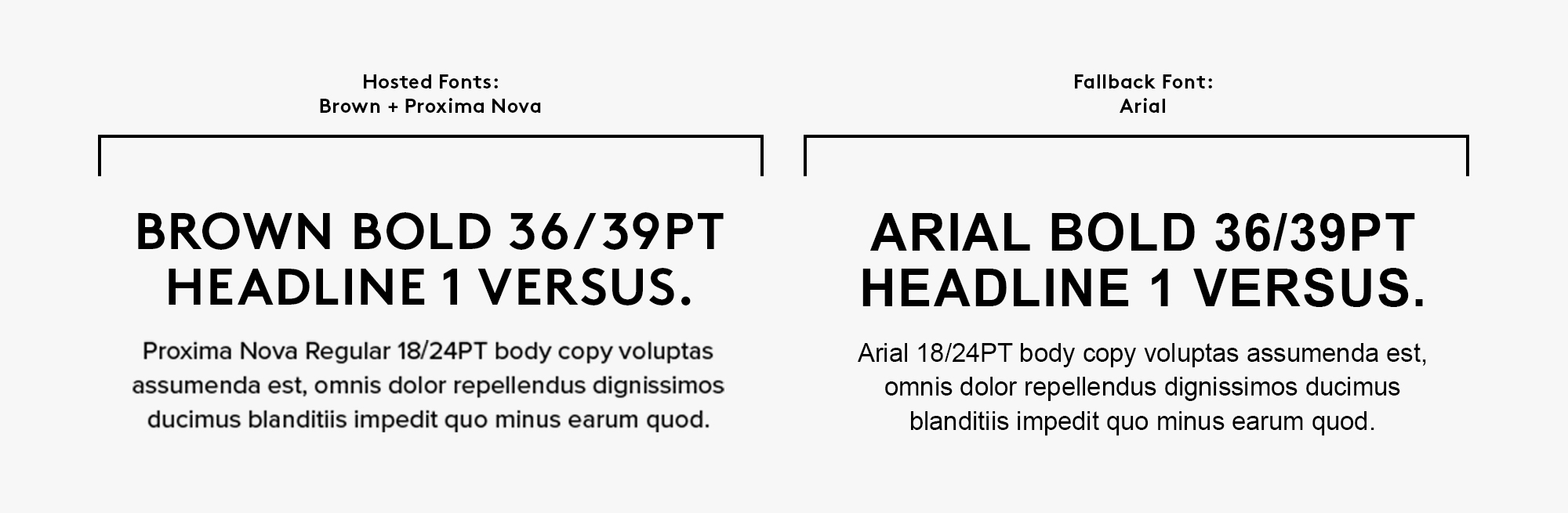
When redesigning an email template to align with a brand refresh, it is critical to first determine what elements and characteristics compose the essence of the brand. In other words, if the logo is removed, what elements of the design (color palette, fonts, photo & illustration style, visual composition, etc.) are indicative of a certain brand? In reviewing the style guide and meeting with the agency who created it, it was clear that the new fonts (Brown for headlines and Proxima Nova for body copy) and photo style were the pillars of the new brand. Particularly, the way in which the fonts and photos are used in tandem: headlines over large, experiential images—a look that is simple to execute in print and tricky to execute in email.
Custom Fonts
Before determining how to pull off the copy-over-image look, we first needed to make some decisions as to which fonts we would use in our template update. Using Google Fonts in email is a safe and simple practice as they are already hosted and easy to embed by adding a snippet of code to the head of the HTML document. After combing through the sans serif font offerings on Google Fonts, we found a few that were close, but none that were close enough to the weight, shape, and overall character of Brown and Proxima Nova for our liking.
Because the fonts are such a key component of the brand, we came to the conclusion that using the exact typefaces was the only viable option. In order to do so, we needed to figure out how to host the fonts on our servers—a process that included ensuring we had the correct server settings, font files, and font licenses. As with any new feature in email, testing is a must, and we were thrilled to learn that load times for these custom hosted fonts did not differ significantly from those of other hosted fonts (such as Google Fonts). However, there is always a caveat in email—in the case of hosted fonts, they are not supported everywhere (primarily Gmail & Outlook). Thus, it is important to assign “fallback” fonts for environments where hosted fonts are unsupported. Ideally, the fallback font is a system font, meaning that it is pre-installed on the majority of systems. Since Arial is a close visual match to our custom fonts and is installed on 99.8% of Windows and 98.7% of Mac computers, it was the logical choice.
Background Images
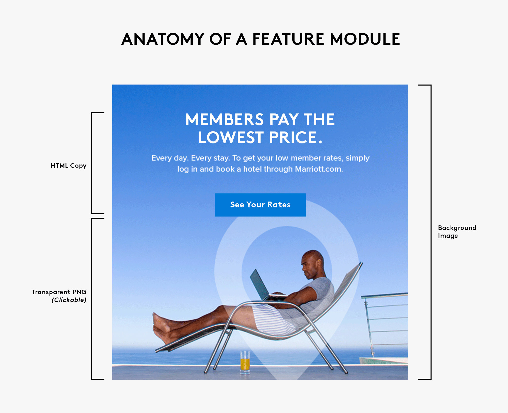
Our next design and coding challenge in the Marriott Rewards template redesign was identifying a solution that would allow us to put copy in images while remaining email best-practice and ADA compliant. Including the copy in the image itself was not an option for a number of reasons. Not only does this option render the images-off view of the email essentially useless, it would be an ADA violation as screen readers cannot read copy in images. Additionally, Marriott Rewards emails are translated in multiple languages in order to speak to their global audience—a fact that would create a production nightmare when dealing with copy in images.
After consulting our web production team, we arrived at a solution which allows us to be both brand & ADA compliant: utilizing background images with HTML copy overlays for feature modules. This treatment requires a number of design and coding considerations. Images for these modules must be carefully curated and / or edited to ensure that whatever appears behind the text does not compromise legibility. Ideally, the images we chose for these modules have an area of solid color (like the sky in the below example) behind the copy, but in situations where that is not the case, some careful Photoshop work is required to create a space for the type overlay. Because we approach email design with a “mobile first” mentality, the feature modules in this fully responsive template utilize mobile image swaps–meaning that the image that displays on mobile devices is an entirely different image than the one that renders in desktop environments. This allows us to alter the image for legibility in mobile the same way we do in desktop.

As mentioned with custom fonts, email is a medium with many quirks and caveats. One drawback of the background image solution is that background images are not clickable—a fact that would’ve been a deal breaker for our client as the wanderlust-y images we feature garner a lot of clicks. Thankfully, our web production team created a workaround: placing a clickable transparent PNG over the image portion of the module.
2. Less is More
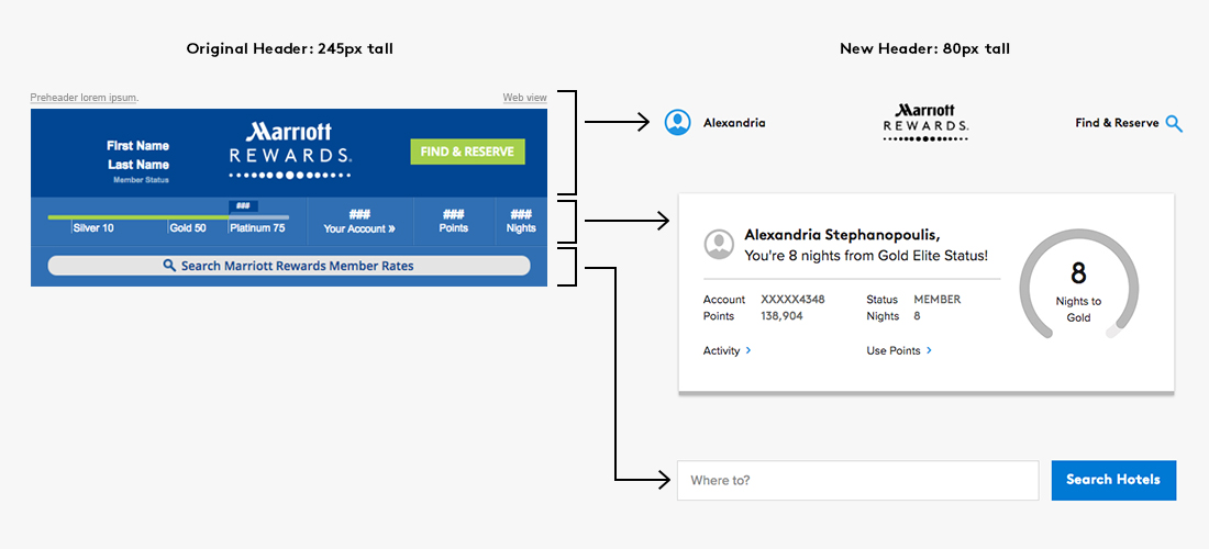
In addition to reflecting the brand refresh, we took the template redesign as an opportunity to modernize the design. A quick glance through your inbox will reveal an industry trend towards minimalism: less copy, larger images, more white space, and less content overall. We applied these principles throughout the template redesign, but it is most apparent in the new header and footer as a minimalistic “shell” allows the content to steal the show.
The original Marriott Rewards template opens with a header dedicated to dynamically populated member data. In the redesign, we moved all of these data points and the search bar into separate modules which can be included or excluded depending on the needs of an individual campaign. We also hid the preheader to create an ultra-clean header that consumes less real estate, and ultimately gets recipients to the content faster.
Marriott Rewards emails frequently feature promotions and offers that must contain disclaimer or legal copy. Typically, these are tacked onto the end of a section–not an ideal solution as this adds visual clutter to the layout and increases the length of the email. After discussing potential solutions with our web production team, we came to a progressive disclosure solution—a click on “Terms & Conditions” reveals a drop-down which contains legalese and unsubscribe verbiage. As with the header, we wanted to significantly simplify in order to keep the recipient’s attention where we want it: on the content of the email.

3. Conclusion
Whether the result of a brand update, or simply the need to refresh and update, template redesigns are inevitable. Although email presents a unique set of technical challenges, with some design and coding creativity, it is certainly possible to design templates that are true to brand, email best-practice compliant, and beautiful.
